
Reading STEM Charts
Last updated on 2026-10-13 | Edit this page
This video lecture content is also available in:
Google Slides that can be copied and edited.
A scrollable version below.
Overview
Questions
- What are the major STEM chart types that are used by Du Bois?
- What universal design practices can make charts more accessible and effective?
- How to interpret STEM charts?
Objectives
- Understand which chart types are best suited for data with different levels of measurement (nominal, ordinal and continuous).
- Read and interpret the analysis in one of the Du Bois charts.
- Identify best practices for chart accessibility and impact in a Du Bois chart.
- Draw a STEM chart by hand using statistics that describe real data.
Data and Chart Types
- We use different types of graphs based on the types of data and relationships we are analyzing.
- Du Bois used variants of commonly used graph types: (pie, bar, Cartesian line charts, and statistical maps).
More complex applications
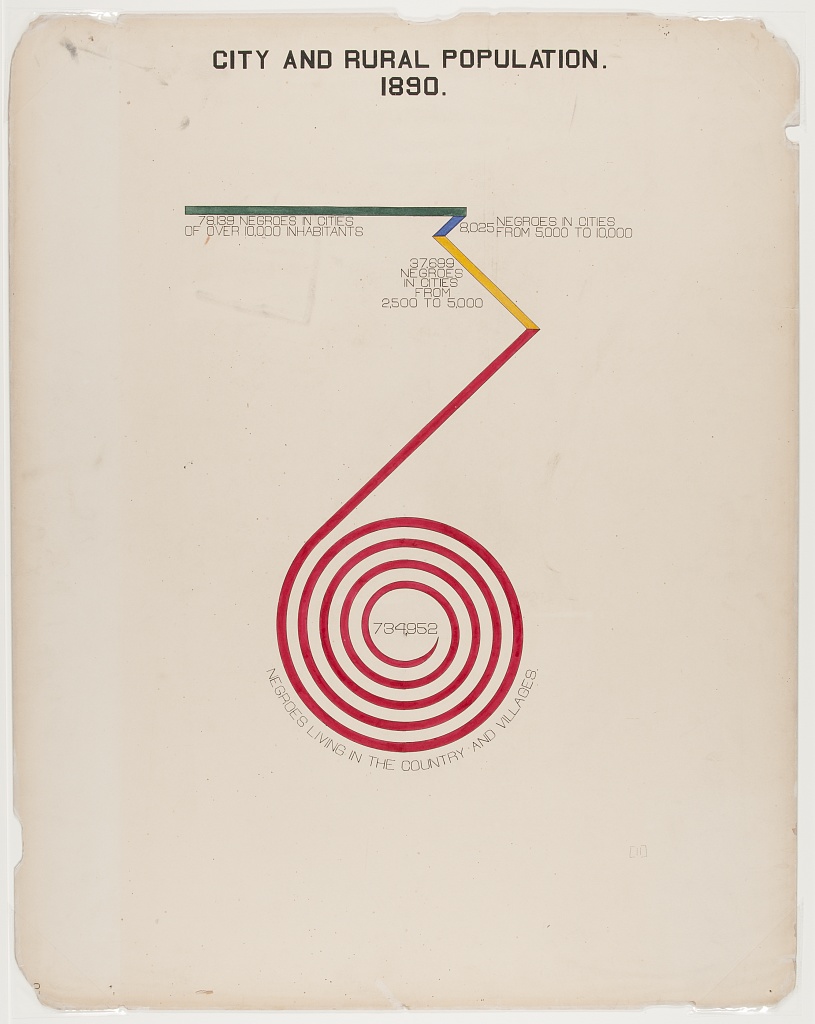
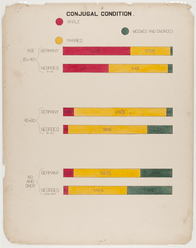
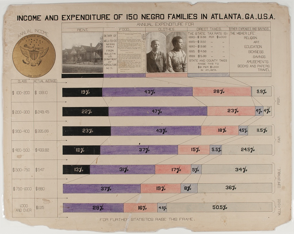
- You can also explore more complex applications of these chart types using the Du Bois Resources repository for this lesson:
- These more complex applications include the fanciful Du Bois spiral, stacked bar charts, and integrated photographs.
Types of Data
We use different chart types for different types of data. Two key types of data are sometimes referred to as levels of measurement:
- Categorical (also called nominal. Examples: demographic group or species).
- Continuous (also called interval ratio. Examples: distance, duration, quantity).
Types of Statistics
Charts commonly use visual elements to represent statistics computed from either categorical or continuous data, including:
- Proportions (from categorical data)
- Frequencies (from categorical data or a quartile of continuous data)
- Central tendencies like means, medians (from continuous measures)
Number of variables
Different variants of charts are also used to represent data for multiple related variables. But even pie charts, which represent a distribution across categories of a single categorical variable, can be used to represent data for multiple variables by splitting the chart into separate panels for units in different subcategories.
Chart Types
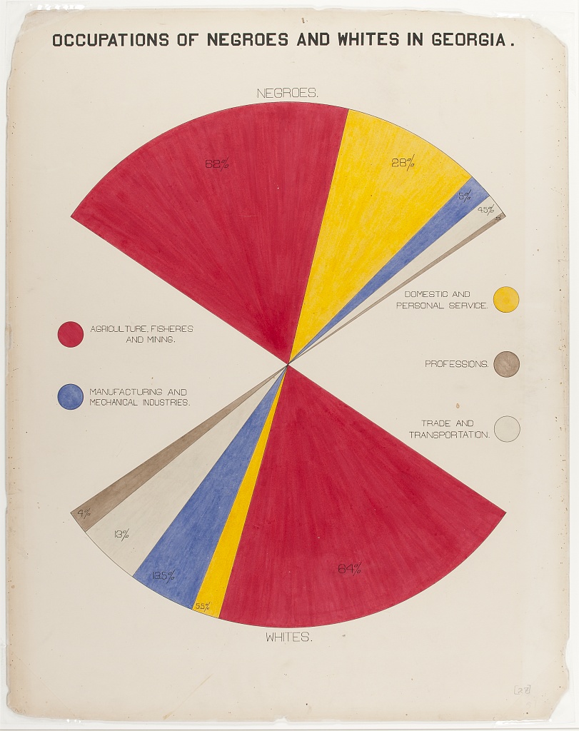
Pie Charts
- Pie charts illustrate the proportion (or percentage) of units observed in different exclusive categories (like occupations) within a population, with all the percentages adding up to 100%.
- This analyzes a distribution across one categorical variable.
- Du Bois’ fanchart variant of a pie chart below creatively compares distributions of people across one categorical variable (occupations) within categories for another variable (race).
Bar Charts
- Bar graphs compare statistics for one variable across bar categories for another variable.
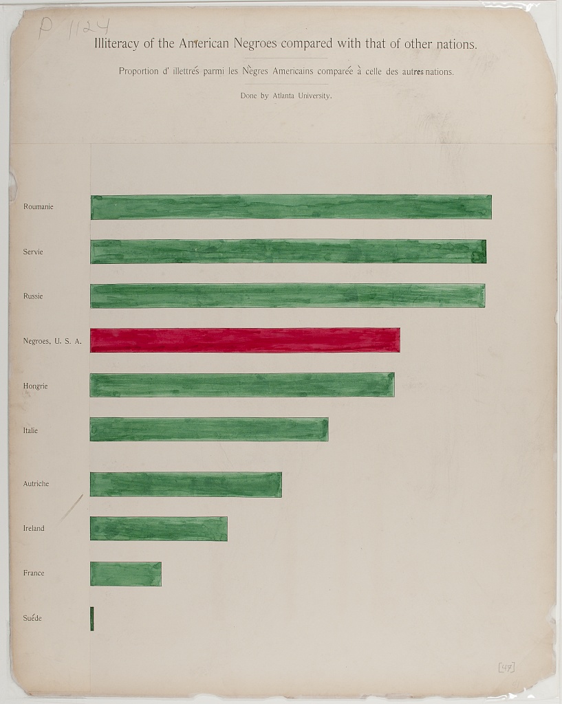
- As in the graph below, a bar graph can represent statistics for a categorical variable like frequencies or percentages of literacy within bar categories of the other variable (in this case nation). This bar graph thus visualizes elements of a contingency table.
- A bar graph can also represent statistics of continuous variables like means within bar categories of another variable.
- Cluster bar charts can be used for comparisons across additional categorical variables.
Cartesian Line Charts
- These graphs allow us to represent relationships between two variables with continuous measures.
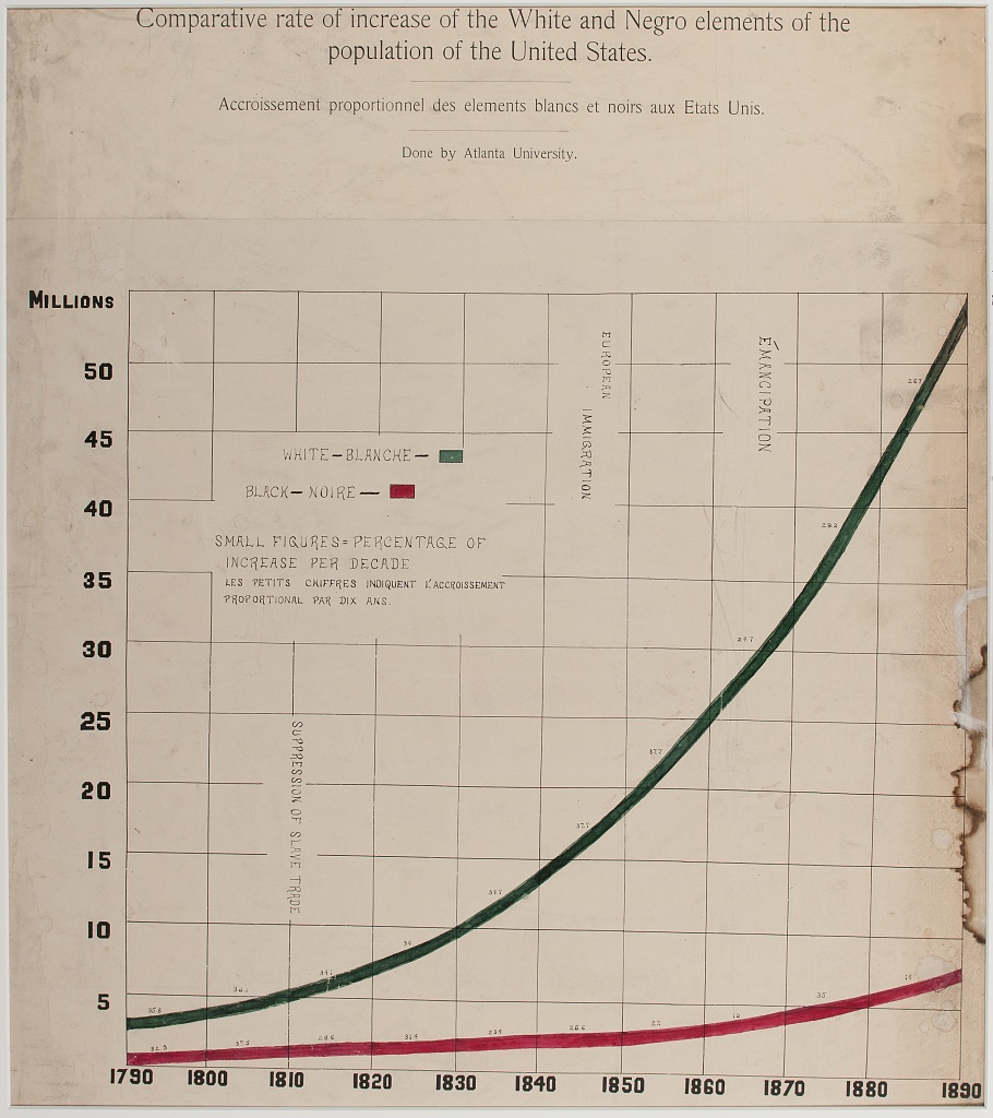
- The **Cartesian line graph* below represents the frequency of the total population within the white and Black categories of a race variable on the Y-axis over year as a continuous variable on the X-axis.
- Line graphs can also use multiple lines for different categories of a variable (like race) to represent the relationship of a 2nd continuous variable (like average income) on the Y-axis between those categories and across variation in a third continuous variable on the X-axis (like year).
- Scatter plots use a similar framework, plotting a point for each observed unit according to its continuous observed values for one variable on the Y-axis and another variable on the X-axis. Regression or fitted lines then represent the relationship between these two variables.
- Time series line graphs, with time on the x-axis, are the most common type of Cartesian line graph.
Statistical Maps
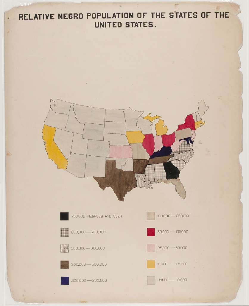
- Statistical maps graph geo-spatial distributions of continuous interval-ratio variables (like the Black population of the U.S.) across categorical geographic units like states.
- In our mapping activity, we review methods for choosing choropleth (color and shading) categories that represent different ranges of continuous measures (like Black population size) between geographic units.
Other chart variants
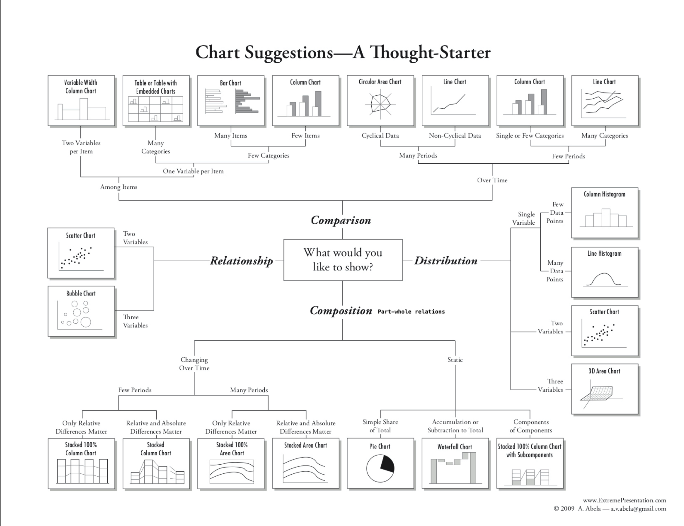
This diagram offers a tool for choosing between additional variants of (chart types for different types of data and analyses:)[https://github.com/HigherEdData/Du-Bois-STEM]
Design Aesthetics and Accessibility
While Du Bois sought to make his visualizations accessible to broad audiences, advances in universal design practices do even more to make visualizations accessible to people with diverse visual, cognitive, auditory, or motor strengths and needs. Practices include:
Keeping visuals as simple as possible, presenting only information necessary for analysis.
Color-blind friendly use of color and contrast, avoiding over-reliance on color
Alternative text (alt text) that screen readers can use to provide an audio description of images.
Descriptive titles and labels
Offering both visual and non-visual formats
Including narrative text with context and summaries
Context and Data Story
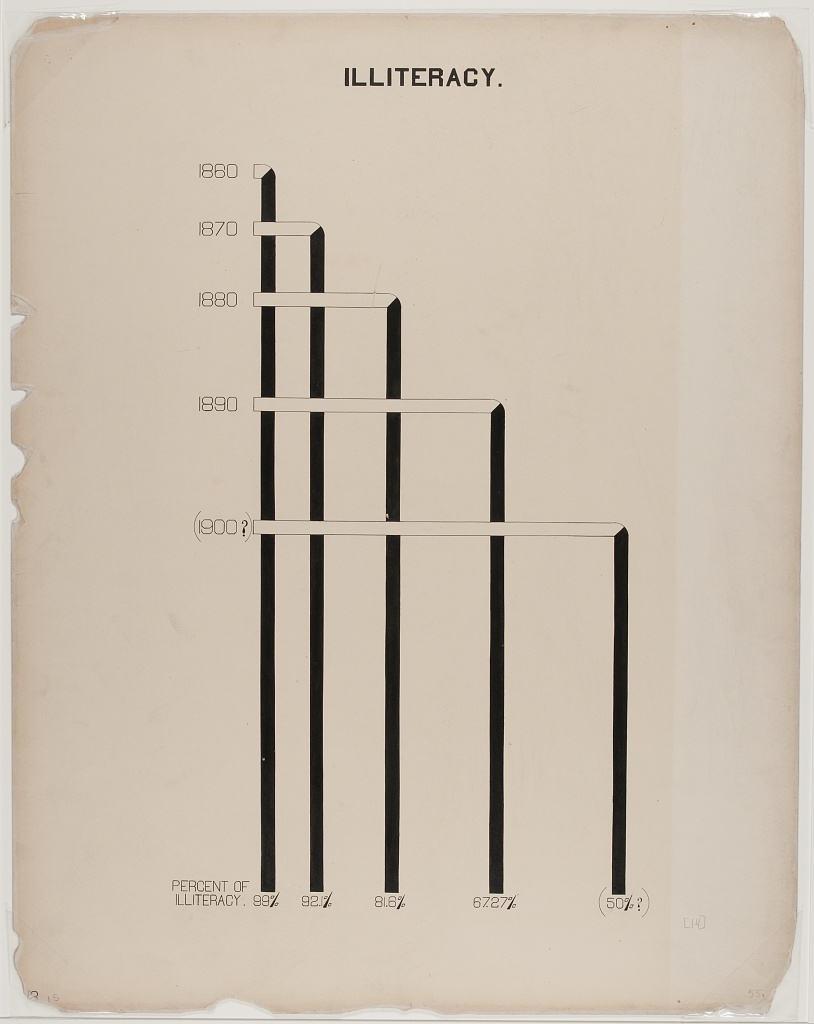
Du Bois presented his graph for illiteracy among Black Americans and other nations (left), together with the graph of Black illiteracy in Georgia from 1865 to 1900. What data story do these 2 graphs tell together?
Literacy Bar Chart: a worked example
Challenge 1: Reading the Chart
- What type of graph is this?
- What variables are plotted on the chart? Are the variables categorical, ordinal, or interval / ratio?
- What statistics are plotted?
- Which category is highlighted?
- How does Black illiteracy compare to literacy in other countries on the chart?
How does Black illiteracy (the red bar) compare with other countries
- What variables are plotted: Country, Illiteracy rate
- Variable types: Country is categorical. Illiteracy rate is continuous, though it is derived from person-level categorical measures (literate or not literate)
- Statistics plotted: Proportions (as percentages) of illiteracy rate
- The Black illiteracy rate is highlighted.
- Black illiteracy is in the middle of the range for European countries – higher than for some and lower than for others.
Challenge 2: Assessing Design Aesthetics and Accessibility
What makes the bar chart above graph easy or difficult to understand?
How is the graph aesthetically appealing? How could could it be more appealing?
How does this graph take its audience into consideration?
What tools would you need to create this graph by hand?
This visual, a conventional bar graph, uses spot color to highlight the data for Black Americans compared to other countries, showing the illiteracy rate to be at the midpoint compared to other nations.
The chart portion is a large percentage of the canvas, simply showing the message.
Note the bilingual labels and titles (a nod to the venue and audience).
Challenge 3: Re-Create with Modern Data and Accessible Design
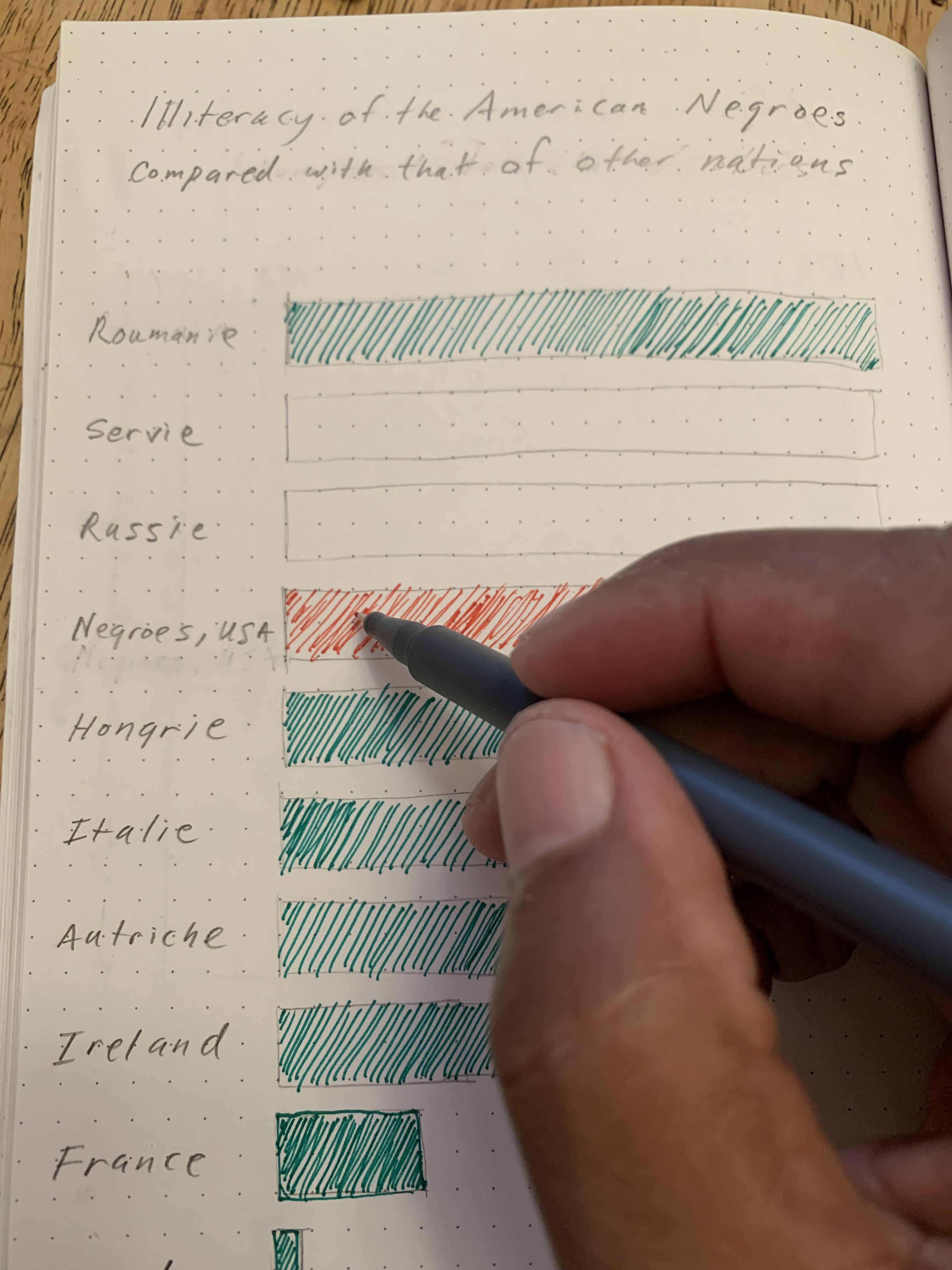
Activity: Hand draw a recreation of Du Bois’ graph using the data below on college attainment today.
Building what accessible design improvements can you make?
Data:
Country		College

Russia		60
Ireland		54
Sweden		49
France		42
Black U.S.
Residents	36
Austria		36
Hungary		29
Serbia		28
Romania		20
Italy		20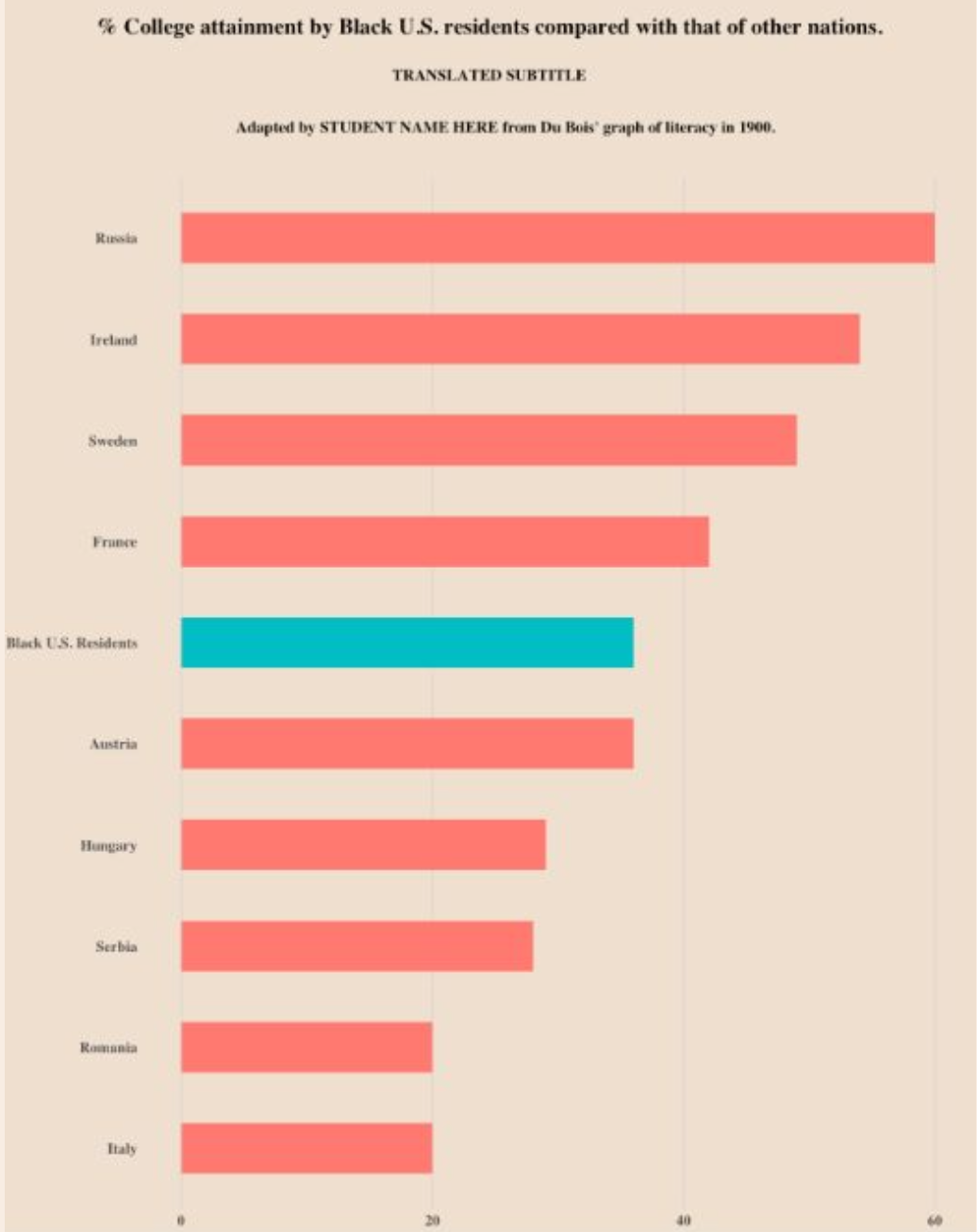
- Even simple chart types can convey interesting meaning. Color man be used to emphasize points
- Use specific charts based on their data type.
- Du Bois’ data charts show best practices for STEM chart accessibility and effectiveness.
- Interpret charts by identifying the variables and statistics.